Interactive charts manual
A chart manual for Inuko apps.
Interactive charts are available for any list of records in the app.
That means, that any time you see a list of records in the app,
you can also have a visual chart representation of them.
Getting started
In order to view existing or create new charts, you start by clicking the chart button in the upper right.
If this button is not available ask your administrator to add it.
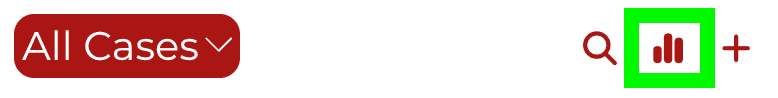
Next, you can choose from the list of existing charts, or choose New Chart and start designing your own.
Chart definition
Each chart only needs a few basic parameters to get started.
In a nutshell, each chart is a graphical representation of a simple mathematical operation over a group of records. We plot each group as a data point from left to right on the X axis. The value for X is rendered as the Y value at that spot.
Data source
This one is free. The chart will use the records in the list. As you filter the list of data the chart will update to match.
Y or Vertical axis
 Simply put, these are the numbers we want to calculate. Eg. how many records are there? What is the sum of invoices? etc.
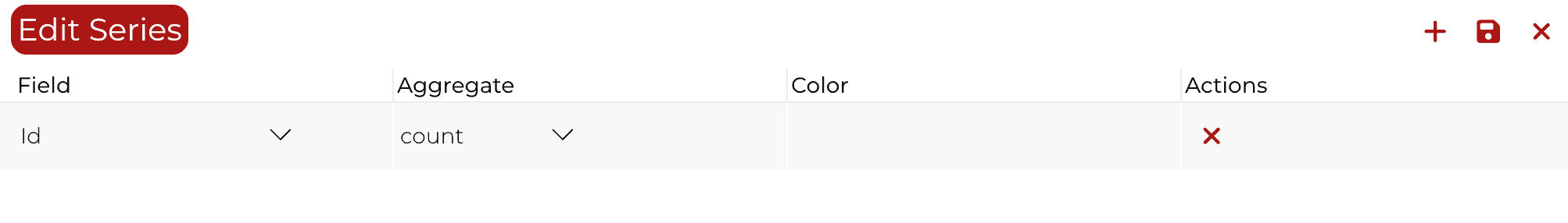
On the left hand side of the chart, we have 3 controls.
First is the operation, which tells the app how to calculate the number we need.
You can choose
-
count - each record is counted as 1. Quick tip: To get the number of records, choose Count and Id
-
countdistinct - only distinct values are counted. Example: counting the number of distinct customers in a list of invoices.
-
min, max, avg - this calculate the minimum, maximum and average values. They only make sense for numeric values.
-
sum - calculates the sum of values. Empty values are counted as 0. Only for numeric values.
Second control is the name of field. For each record, the value used in the operation will come from this field. What fields there are depend on the list you are using. For example for invoices there will be the Total Amount.
The third control is for advanced charts. It allows you to create multiple series. That is multiple combinations of aggregation, field and color.
(Color uses the web format of #RRGGBB (red, green blue). For example #FF0000 is red, #00FF00 is green and #0000FF is blue.)
X or Horizontal axis
The axis that defines the category, by which we break down the numbers.
In effect it will break down the list of records from our data source into separate groups, and calculate the Y value separately for each group. Hence the name group by.
For example if we want to know the number of records of a certain type. Or if we want to know the sum of invoices per month.
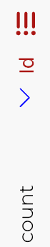
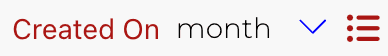
We design the X axis with 3 controls. The first control chooses the field which defines the category.
If the field is a date, such as “Created On” - when the record was added to the database, you can choose which part of the date represents the category: Year, Quarter, Month, Week or Day.
For other field types only the column category is meaningful. The value of the category is exactly the record’s field value.
Finally the third control (the list icon), is an advanced feature, that allows you to create further sub-groups within groups.
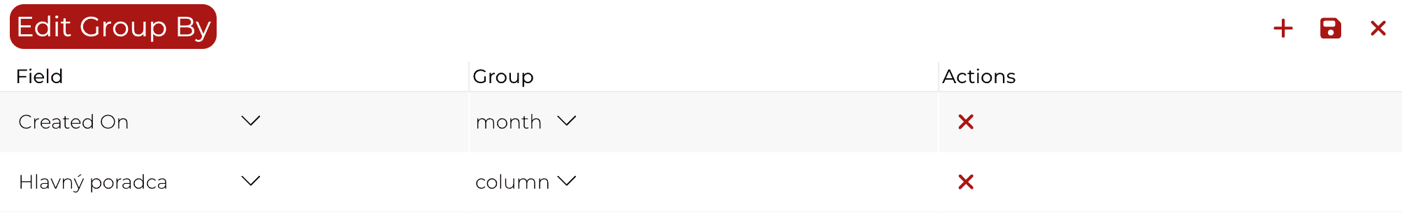
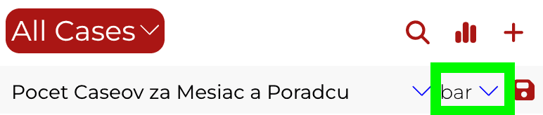
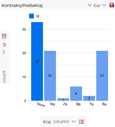
Chart Types
There are two chart types:
Line - shows a continuous curve connecting data points
Bar - renders each data point as an individual filled rectangle.
To change the chart type simply click on the type selector in the upper right.
Note for advanced charts: Only line chart type is supported for multiple series. Only bar chart type is supported for multiple groups.
Saving your Chart
To save and reuse your chart in the future, click on the save button.
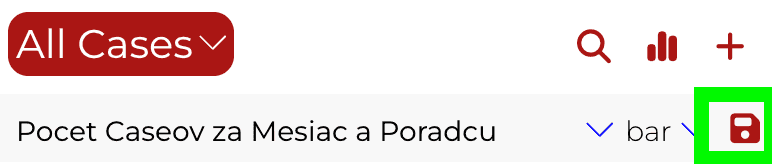
A dialog will open, where you can give your chart a name and confirm the save operation.
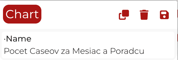
You can also delete your chart from here.

And, if needed, create a copy.

Interactive filter
Bar charts are interactive, clicking any bar will filter the list of records below the chart, revealing only the records that are within the selected group.
Charts for your journey
We hope you find charts useful in your apps.
Let us know, if you'd like to see more options, or something isn't working right.
Continue reading
Searching and filtering in Inuko apps


To quote captain obvious, we humans spend a lot of time searching. For socks, keys and phones all the way into the digital world. So much in fact, that one of the most valuable companies is the search engine. Now if that is so obvious, why do most apps provide such a broken search experience?
Look what the bunny dragged in


One of the newer addition to Easter is for apps to hide “easter eggs”. In case you missed it, an app’s easter egg is a hidden, usually fun feature or animation accessible only with an obscure key combination.
But is not always fun and games that are…
SMS Notifications


Do you remember the time before digital calendars and reminders?
When dinosaurs roamed the world and you had to whack your dinner over the head.
Or something like that.